Contents
Kaplan-Meier Curves for Retention: How to Read and Explain Them
A practical guide to Kaplan-Meier survival curves for product retention analysis. Learn to create, interpret, and explain retention curves to stakeholders, with handling for censoring and confidence intervals.
Quick Hits
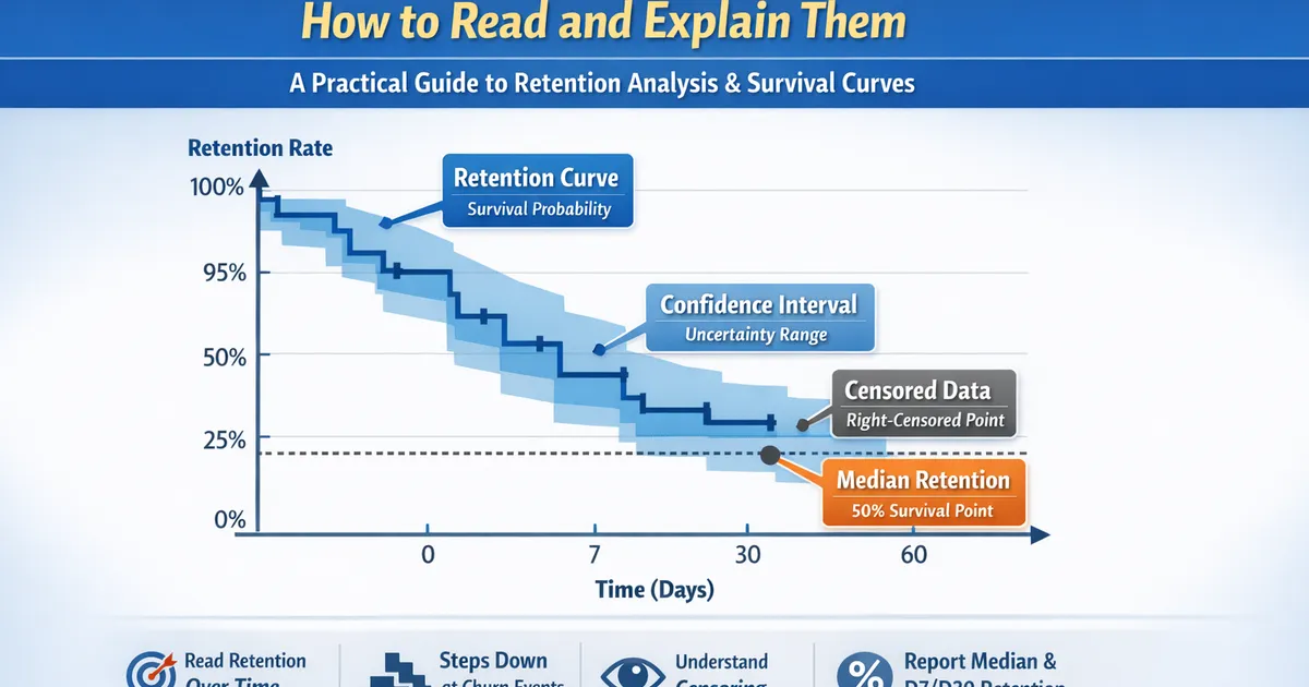
- •KM curves show the probability of 'survival' (retention) over time
- •Steps down only at event times, not censoring times
- •Width of confidence band shows uncertainty - wider = less data
- •Median survival is where the curve crosses 50%
- •Always report retention AT specific times (D7, D30) not just curves
TL;DR
Kaplan-Meier curves show the probability of retention over time, accounting for users who haven't churned yet (censored). Reading the curve is simple: the y-value at any time point is your retention at that time. Steps down occur at churn events; flat sections mean no churns. Confidence bands show uncertainty—wider bands mean less data. Always report retention at specific time points (D7, D30) with confidence intervals.
What the Curve Shows
The Y-Axis: Survival Probability
At any time t, the y-value is:
- Y = 1.0 at time 0 (everyone starts retained)
- Y decreases as users churn
- Y at day 30 = your D30 retention
The X-Axis: Time Since Origin
Usually time since:
- Signup
- Feature launch
- Experiment start
- Any meaningful starting point
The Steps
The curve steps DOWN at each event (churn) time:
- Step size depends on how many churned and how many were at risk
- More churns = bigger step
- Smaller "at risk" population = bigger step for same number of churns
Censoring Marks
Often shown as tick marks (+) on the curve:
- Indicate where observations were censored (not churned but stopped being observed)
- Censored users reduce the "at risk" pool but don't cause steps down
How Kaplan-Meier Works
The Formula
At each event time, multiply the current survival by:
Step-by-Step Example
| Day | At Risk | Churned | Censored | Calculation | S(t) |
|---|---|---|---|---|---|
| 0 | 100 | 0 | 0 | — | 1.000 |
| 3 | 100 | 2 | 0 | 0.980 | |
| 7 | 98 | 5 | 3 | 0.930 | |
| 14 | 90 | 10 | 0 | 0.827 | |
| 21 | 80 | 0 | 5 | No event | 0.827 |
| 28 | 75 | 8 | 0 | 0.739 |
Reading: D7 retention , D14 retention , D28 retention
Reading the Curve
Reading Retention at Specific Times
        1.0 |----+
            |    \
        0.8 |     +--\
            |         \
        0.6 |          +----+
            |               \
        0.4 |                \
            |
        0.2 |
            |
        0.0 +------------------------
            0   30   60   90   120
                   Time (days)
How to read:
- D30 retention: ~0.70 (70%)
- D60 retention: ~0.58 (58%)
- D90 retention: ~0.58 (flat section = no events)
- Median survival: ~80 days (where curve crosses 0.50)
Confidence Intervals
The shaded region or dashed lines around the curve show 95% CI:
- Where CI is narrow: estimate is reliable
- Where CI is wide: fewer users, more uncertainty
- CI always widens toward the right (fewer remaining users)
Median Survival Time
The point where S(t) = 0.50:
- Half of users have churned by this time
- May not exist if retention stays above 50%
- Read directly from the curve where it crosses 0.50
Code: Creating and Reading KM Curves
Python
import numpy as np
import pandas as pd
from lifelines import KaplanMeierFitter
import matplotlib.pyplot as plt


def create_retention_curve(data, time_col='tenure_days', event_col='churned',
                           title='Retention Curve', figsize=(10, 6)):
    """
    Create a Kaplan-Meier retention curve.

    Parameters:
    -----------
    data : pd.DataFrame
        Dataset with time and event columns
    time_col : str
        Time variable (days since signup)
    event_col : str
        Churn indicator (1=churned, 0=censored/active)

    Returns:
    --------
    dict with KM fitter and key metrics
    """
    kmf = KaplanMeierFitter()
    kmf.fit(data[time_col], data[event_col], label='Retention')

    # Create figure
    fig, ax = plt.subplots(figsize=figsize)
    kmf.plot_survival_function(ax=ax, ci_show=True)

    # Formatting
    ax.set_xlabel('Days Since Signup')
    ax.set_ylabel('Retention Rate')
    ax.set_title(title)
    ax.set_ylim(0, 1)
    ax.set_xlim(0, data[time_col].max())

    # Add grid for easier reading
    ax.grid(True, alpha=0.3)
    ax.set_yticks([0, 0.25, 0.5, 0.75, 1.0])
    ax.set_yticklabels(['0%', '25%', '50%', '75%', '100%'])

    # Calculate key metrics
    metrics = {}
    for day in [1, 7, 14, 30, 60, 90]:
        if day <= data[time_col].max():
            retention = kmf.survival_function_at_times(day).values[0]
            # Get CI
            ci = kmf.confidence_interval_survival_function_.loc[day]
            metrics[f'D{day}'] = {
                'retention': retention,
                'ci_lower': ci.iloc[0],
                'ci_upper': ci.iloc[1]
            }

    metrics['median_survival'] = kmf.median_survival_time_
    metrics['kmf'] = kmf

    return metrics, fig


def retention_table(kmf, times=[1, 7, 14, 30, 60, 90]):
    """
    Create a retention table at specific time points.
    """
    rows = []
    for t in times:
        try:
            surv = kmf.survival_function_at_times(t).values[0]
            ci = kmf.confidence_interval_survival_function_.loc[t]
            rows.append({
                'Day': t,
                'Retention': f"{surv:.1%}",
                '95% CI': f"[{ci.iloc[0]:.1%}, {ci.iloc[1]:.1%}]"
            })
        except:
            pass

    return pd.DataFrame(rows)


def explain_retention_curve(metrics):
    """
    Generate stakeholder-friendly explanation of retention metrics.
    """
    lines = ["Retention Analysis Summary", "=" * 40]

    if 'D1' in metrics:
        lines.append(f"\nDay 1 (Next-Day Retention): {metrics['D1']['retention']:.1%}")

    if 'D7' in metrics:
        d7 = metrics['D7']
        lines.append(f"Day 7 Retention: {d7['retention']:.1%} (95% CI: {d7['ci_lower']:.1%} to {d7['ci_upper']:.1%})")

    if 'D30' in metrics:
        d30 = metrics['D30']
        lines.append(f"Day 30 Retention: {d30['retention']:.1%} (95% CI: {d30['ci_lower']:.1%} to {d30['ci_upper']:.1%})")

    if metrics['median_survival'] is not None:
        lines.append(f"\nMedian Retention Time: {metrics['median_survival']:.0f} days")
        lines.append("(Half of users are still retained at this point)")
    else:
        lines.append("\nMedian Retention Time: Not reached")
        lines.append("(More than half of users are still retained)")

    return "\n".join(lines)


# Example usage
if __name__ == "__main__":
    np.random.seed(42)
    n = 1000

    # Generate realistic retention data
    # Exponential baseline with hazard decreasing over time (early churn is common)
    signup_days_ago = np.random.uniform(0, 180, n)  # Users signed up 0-180 days ago

    # Survival time (days until churn)
    hazard = 0.02  # 2% daily churn rate
    survival_time = np.random.exponential(1/hazard, n)

    # Observation time is min(survival_time, days since signup)
    observed_time = np.minimum(survival_time, signup_days_ago)
    churned = (survival_time <= signup_days_ago).astype(int)

    data = pd.DataFrame({
        'tenure_days': observed_time,
        'churned': churned
    })

    print(f"Dataset: {len(data)} users")
    print(f"Churned: {churned.sum()} ({churned.mean():.1%})")
    print(f"Censored (still active): {len(data) - churned.sum()}")

    # Create curve
    metrics, fig = create_retention_curve(data, 'tenure_days', 'churned')

    # Print metrics
    print("\n" + explain_retention_curve(metrics))

    # Retention table
    print("\nRetention Table:")
    print(retention_table(metrics['kmf']).to_string(index=False))

    plt.show()
R
library(tidyverse)
library(survival)
library(survminer)


create_retention_curve <- function(data, time_col, event_col, title = "Retention Curve") {
    #' Create Kaplan-Meier retention curve with key metrics

    # Create survival object
    surv_obj <- Surv(data[[time_col]], data[[event_col]])

    # Fit KM
    km_fit <- survfit(surv_obj ~ 1, data = data)

    # Plot
    p <- ggsurvplot(
        km_fit,
        data = data,
        conf.int = TRUE,
        risk.table = TRUE,
        risk.table.height = 0.25,
        xlab = "Days Since Signup",
        ylab = "Retention Rate",
        title = title,
        palette = "steelblue",
        break.x.by = 30,
        ggtheme = theme_minimal()
    )

    # Extract metrics at key time points
    summary_times <- summary(km_fit, times = c(1, 7, 14, 30, 60, 90))

    metrics <- tibble(
        Day = summary_times$time,
        Retention = summary_times$surv,
        CI_Lower = summary_times$lower,
        CI_Upper = summary_times$upper,
        At_Risk = summary_times$n.risk
    )

    list(
        fit = km_fit,
        plot = p,
        metrics = metrics,
        median = summary(km_fit)$table["median"]
    )
}


retention_table <- function(km_fit, times = c(1, 7, 14, 30, 60, 90)) {
    #' Create retention table at specific times

    s <- summary(km_fit, times = times)

    tibble(
        Day = s$time,
        Retention = sprintf("%.1f%%", s$surv * 100),
        `95% CI` = sprintf("[%.1f%%, %.1f%%]", s$lower * 100, s$upper * 100),
        `At Risk` = s$n.risk
    )
}


# Example
set.seed(42)
n <- 1000

# Generate data
signup_days_ago <- runif(n, 0, 180)
hazard <- 0.02
survival_time <- rexp(n, hazard)
observed_time <- pmin(survival_time, signup_days_ago)
churned <- as.integer(survival_time <= signup_days_ago)

data <- tibble(
    tenure_days = observed_time,
    churned = churned
)

cat(sprintf("Dataset: %d users\n", nrow(data)))
cat(sprintf("Churned: %d (%.1f%%)\n", sum(churned), mean(churned) * 100))

# Create curve
result <- create_retention_curve(data, "tenure_days", "churned")

# Print metrics
cat("\nRetention Table:\n")
print(retention_table(result$fit))

cat(sprintf("\nMedian Retention Time: %.0f days\n", result$median))

# Display plot
print(result$plot)
Explaining to Stakeholders
The 30-Second Explanation
"This curve shows what percentage of users are still active over time. At day 7, we retain 85% of users. By day 30, that drops to 65%. The shaded area shows our confidence range—wider bands mean more uncertainty."
Common Questions and Answers
Q: Why doesn't it start at 100%? A: It should. If it doesn't, there's usually a data issue (immediate churns on day 0).
Q: Why is it stepped, not smooth? A: The curve only updates when someone actually churns. Steps show real churn events.
Q: Why is the confidence band wider at the end? A: Fewer users remain in the analysis. Less data = more uncertainty.
Q: What's the number in the "at risk" table below the curve? A: How many users were still in the analysis (not yet churned or censored) at that time point.
Q: Can retention go up? A: No. By definition, once someone churns, they're out. (Unless you're modeling return, which is different.)
Comparing Two Curves
When showing treatment vs. control:
- Higher curve = better retention
- If curves don't overlap much = probably different
- Log-rank p-value tells you if difference is significant
Common Mistakes
Mistake 1: Ignoring Censoring
Wrong: Calculate D30 retention as (users active at D30) / (total users)
Problem: Users who signed up less than 30 days ago haven't had a chance to reach D30.
Right: Use Kaplan-Meier, which properly handles users who haven't reached that time point.
Mistake 2: Comparing Curves Visually Without Testing
Wrong: "The premium curve looks higher, so premium users retain better"
Right: Run a log-rank test. Visual differences may not be significant, and overlapping confidence bands at some times don't mean curves are equal.
Mistake 3: Reporting Median When It Doesn't Exist
Wrong: "Median retention time is infinity" (when curve never crosses 50%)
Right: Report "Median retention time not reached; more than 50% of users are retained at [max observation time]"
Mistake 4: Using the Wrong Time Origin
Wrong: Mixing users with different observation start points (some from signup, some from feature launch)
Right: Define a consistent time origin. If comparing cohorts, adjust for calendar time effects.
Related Methods
- Time-to-Event and Retention Analysis (Pillar) - Full survival framework
- Log-Rank Test - Comparing curves
- Censoring Explained - Understanding censoring
- Comparing Retention Curves - Multiple groups
Key Takeaway
Kaplan-Meier curves are the standard way to visualize retention while properly handling users who haven't churned yet. To read the curve: find your time point on the x-axis, trace up to the curve, and read the y-value—that's your retention rate. Steps occur at churn events; flat sections mean no churns. Always report specific time-point retention (D7, D30) with confidence intervals, and use log-rank tests for formal group comparisons.
References
- https://www.ncbi.nlm.nih.gov/pmc/articles/PMC3059453/
- https://www.statisticshowto.com/kaplan-meier-survival-curve/
- https://lifelines.readthedocs.io/en/latest/Survival%20Analysis%20intro.html
- Clark, T. G., Bradburn, M. J., Love, S. B., & Altman, D. G. (2003). Survival analysis part I: basic concepts and first analyses. *British Journal of Cancer*, 89(2), 232-238.
- Statistics How To. Kaplan-Meier Survival Curve Explained.
- lifelines documentation. Survival Analysis Intro.
Frequently Asked Questions
Why does my retention curve stay flat sometimes?
How do I calculate D7 or D30 retention from a KM curve?
Why are my confidence bands so wide at later time points?
Key Takeaway
Kaplan-Meier curves visualize retention while properly handling users who haven't churned yet (censoring). Read the y-axis value at any time point to get retention percentage. The curve steps down at each churn, and confidence bands widen as fewer users remain.