Contents
Visual Diagnostics for Group Comparisons: The Plots That Matter
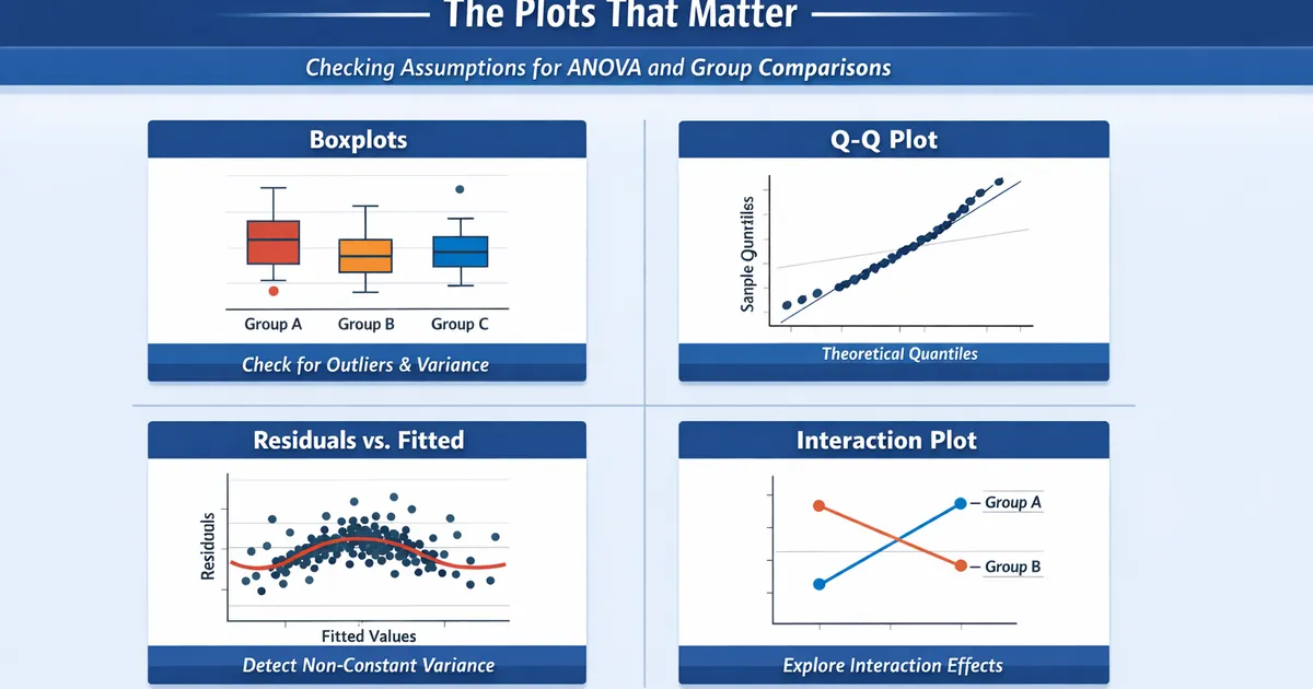
How to visually check assumptions for ANOVA and other group comparisons. Covers boxplots, Q-Q plots, residual plots, and interaction plots with interpretation guidance.
Quick Hits
- •Visual checks are more informative than formal tests for assumption checking
- •Boxplots reveal group differences, outliers, and variance heterogeneity at a glance
- •Q-Q plots show whether residuals follow a normal distribution
- •Residual vs. fitted plots detect non-constant variance and non-linearity
TL;DR
Visual diagnostics beat formal tests for assumption checking. Formal tests have poor properties: they reject trivial violations with large samples and miss serious violations with small samples. Key plots for group comparisons: boxplots (group differences, spread, outliers), Q-Q plots (normality), and residual plots (constant variance, outliers). This guide teaches you to read and interpret these plots.
The Diagnostic Workflow
import numpy as np
import matplotlib.pyplot as plt
from scipy import stats
import pandas as pd

def diagnostic_suite(groups, group_names=None, figsize=(14, 10)):
    """
    Complete visual diagnostic suite for group comparisons.
    """
    if group_names is None:
        group_names = [f'Group {i+1}' for i in range(len(groups))]

    fig, axes = plt.subplots(2, 3, figsize=figsize)

    # 1. Boxplots
    axes[0, 0].boxplot(groups, labels=group_names)
    axes[0, 0].set_title('1. Boxplots by Group')
    axes[0, 0].set_ylabel('Value')

    # 2. Violin plots (distribution shape)
    axes[0, 1].violinplot(groups, positions=range(1, len(groups)+1))
    axes[0, 1].set_xticks(range(1, len(groups)+1))
    axes[0, 1].set_xticklabels(group_names)
    axes[0, 1].set_title('2. Violin Plots (Distribution Shape)')

    # 3. Mean with error bars
    means = [np.mean(g) for g in groups]
    sems = [np.std(g, ddof=1) / np.sqrt(len(g)) for g in groups]
    axes[0, 2].bar(group_names, means, yerr=sems, capsize=5, alpha=0.7)
    axes[0, 2].set_title('3. Means with 95% CI')
    axes[0, 2].set_ylabel('Mean ± SE')

    # 4. Q-Q plot of residuals (pooled)
    grand_mean = np.mean(np.concatenate(groups))
    group_means = [np.mean(g) for g in groups]
    residuals = []
    for g, m in zip(groups, group_means):
        residuals.extend(g - m)
    residuals = np.array(residuals)

    stats.probplot(residuals, dist="norm", plot=axes[1, 0])
    axes[1, 0].set_title('4. Q-Q Plot of Residuals')

    # 5. Residuals vs Fitted
    fitted = []
    for g, m in zip(groups, group_means):
        fitted.extend([m] * len(g))
    fitted = np.array(fitted)

    axes[1, 1].scatter(fitted, residuals, alpha=0.5)
    axes[1, 1].axhline(y=0, color='r', linestyle='--')
    axes[1, 1].set_xlabel('Fitted Values (Group Means)')
    axes[1, 1].set_ylabel('Residuals')
    axes[1, 1].set_title('5. Residuals vs Fitted')

    # 6. Histogram of residuals
    axes[1, 2].hist(residuals, bins='auto', edgecolor='black', alpha=0.7)
    axes[1, 2].set_xlabel('Residual')
    axes[1, 2].set_ylabel('Frequency')
    axes[1, 2].set_title('6. Histogram of Residuals')

    plt.tight_layout()
    return fig


# Example usage
np.random.seed(42)
group1 = np.random.normal(50, 10, 40)
group2 = np.random.normal(55, 12, 40)
group3 = np.random.normal(52, 8, 40)

fig = diagnostic_suite([group1, group2, group3], ['Control', 'Treatment A', 'Treatment B'])
plt.show()
Plot 1: Boxplots
The most important plot for group comparisons. Shows center, spread, and outliers simultaneously.
What to Look For
def annotated_boxplot(groups, group_names):
    """
    Boxplot with interpretive annotations.
    """
    fig, ax = plt.subplots(figsize=(10, 6))

    bp = ax.boxplot(groups, labels=group_names, patch_artist=True)

    # Add annotations
    ax.annotate('Median (center line)', xy=(1, np.median(groups[0])),
                xytext=(1.5, np.median(groups[0])+10),
                arrowprops=dict(arrowstyle='->'))
    ax.annotate('IQR (box height)\nshows spread',
                xy=(1.25, np.percentile(groups[0], 25)),
                xytext=(1.5, np.percentile(groups[0], 25)-15),
                arrowprops=dict(arrowstyle='->'))
    ax.annotate('Whiskers: 1.5×IQR\nor data extent',
                xy=(1, np.min(groups[0])),
                xytext=(1.5, np.min(groups[0])-10),
                arrowprops=dict(arrowstyle='->'))

    ax.set_title('Reading a Boxplot')
    return fig
Checking Equal Variances
def check_variance_visual(groups, group_names):
    """
    Visualize variance comparison across groups.
    """
    fig, axes = plt.subplots(1, 2, figsize=(12, 5))

    # Boxplot
    axes[0].boxplot(groups, labels=group_names)
    axes[0].set_title('Box Heights Show Variance Differences')

    # Variance bar chart
    variances = [np.var(g, ddof=1) for g in groups]
    colors = ['green' if v/min(variances) < 3 else 'red' for v in variances]
    axes[1].bar(group_names, variances, color=colors)
    axes[1].set_title('Variance by Group')
    axes[1].axhline(y=min(variances)*3, color='r', linestyle='--',
                    label='3x smallest (threshold)')
    axes[1].legend()

    return fig


# Example with unequal variances
unequal_var_groups = [
    np.random.normal(50, 5, 40),   # SD = 5
    np.random.normal(55, 15, 40),  # SD = 15 (much larger!)
    np.random.normal(52, 10, 40)   # SD = 10
]

fig = check_variance_visual(unequal_var_groups, ['A', 'B', 'C'])
plt.show()
Interpretation:
- Similar box heights → Equal variances (assumption OK)
- Very different heights → Unequal variances (use Welch's ANOVA/Games-Howell)
Plot 2: Q-Q Plots
Test whether residuals follow a normal distribution.
How to Read Q-Q Plots
def qq_interpretation_guide():
    """
    Show different Q-Q plot patterns and their meaning.
    """
    fig, axes = plt.subplots(2, 2, figsize=(10, 10))

    n = 200

    # Normal data
    normal = np.random.normal(0, 1, n)
    stats.probplot(normal, dist="norm", plot=axes[0, 0])
    axes[0, 0].set_title('Normal: Points on line')

    # Right skewed
    right_skew = np.random.exponential(1, n)
    stats.probplot(right_skew, dist="norm", plot=axes[0, 1])
    axes[0, 1].set_title('Right Skew: Curve up at right')

    # Heavy tails
    heavy_tails = np.random.standard_t(3, n)
    stats.probplot(heavy_tails, dist="norm", plot=axes[1, 0])
    axes[1, 0].set_title('Heavy Tails: S-curve')

    # Light tails (uniform)
    light_tails = np.random.uniform(-2, 2, n)
    stats.probplot(light_tails, dist="norm", plot=axes[1, 1])
    axes[1, 1].set_title('Light Tails: Inverted S-curve')

    plt.tight_layout()
    return fig


fig = qq_interpretation_guide()
plt.show()
Practical Interpretation
| Pattern | Meaning | Action |
|---|---|---|
| Points on line | Normal | Proceed normally |
| Curve up at ends | Heavy tails | Consider robust methods |
| Curve at one end | Skewness | Large samples: usually OK; Small samples: consider transformation |
| Systematic deviation | Non-normality | Check sample size; robust methods if small |
Plot 3: Residuals vs. Fitted
Detect non-constant variance and check model adequacy.
def residual_plot_guide(groups, group_names):
    """
    Create and interpret residual plots.
    """
    # Calculate residuals and fitted values
    group_means = [np.mean(g) for g in groups]
    residuals = []
    fitted = []
    labels = []

    for g, m, name in zip(groups, group_means, group_names):
        residuals.extend(g - m)
        fitted.extend([m] * len(g))
        labels.extend([name] * len(g))

    residuals = np.array(residuals)
    fitted = np.array(fitted)

    fig, axes = plt.subplots(1, 2, figsize=(12, 5))

    # Scatter plot
    for name in group_names:
        mask = np.array(labels) == name
        axes[0].scatter(fitted[mask], residuals[mask], alpha=0.5, label=name)

    axes[0].axhline(y=0, color='r', linestyle='--')
    axes[0].set_xlabel('Fitted Values (Group Means)')
    axes[0].set_ylabel('Residuals')
    axes[0].set_title('Residuals vs Fitted')
    axes[0].legend()

    # Spread-level plot (absolute residuals)
    abs_residuals = np.abs(residuals)
    for name in group_names:
        mask = np.array(labels) == name
        axes[1].scatter(fitted[mask], abs_residuals[mask], alpha=0.5, label=name)

    axes[1].set_xlabel('Fitted Values (Group Means)')
    axes[1].set_ylabel('|Residuals|')
    axes[1].set_title('Spread-Level Plot (Check Constant Variance)')

    return fig


fig = residual_plot_guide(unequal_var_groups, ['A', 'B', 'C'])
plt.show()
What to Look For
Good pattern: Random scatter around zero, similar spread across fitted values.
Problem signs:
- Funnel shape → Variance increases with fitted values
- Different spreads at different x-values → Heteroskedasticity
- Patterns (curves, clusters) → Model inadequacy
Plot 4: Interaction Plots
For factorial designs, check whether effects depend on levels of other factors.
def interaction_plot(df, outcome, factor_a, factor_b):
    """
    Create interaction plot for factorial design.
    """
    means = df.groupby([factor_a, factor_b])[outcome].mean().unstack()
    sems = df.groupby([factor_a, factor_b])[outcome].sem().unstack()

    fig, ax = plt.subplots(figsize=(8, 6))

    for col in means.columns:
        ax.errorbar(means.index, means[col], yerr=1.96*sems[col],
                   marker='o', linewidth=2, capsize=5, label=col)

    ax.set_xlabel(factor_a)
    ax.set_ylabel(f'Mean {outcome}')
    ax.set_title('Interaction Plot')
    ax.legend(title=factor_b)

    # Add interpretation note
    ax.annotate('Parallel lines = No interaction\nNon-parallel = Interaction',
                xy=(0.02, 0.98), xycoords='axes fraction',
                verticalalignment='top',
                bbox=dict(boxstyle='round', facecolor='wheat'))

    return fig


# Example
np.random.seed(42)
df_factorial = pd.DataFrame({
    'outcome': np.concatenate([
        np.random.normal(50, 10, 30),  # A1, B1
        np.random.normal(52, 10, 30),  # A1, B2
        np.random.normal(55, 10, 30),  # A2, B1
        np.random.normal(65, 10, 30),  # A2, B2 (interaction!)
    ]),
    'factor_a': np.repeat(['A1', 'A1', 'A2', 'A2'], 30),
    'factor_b': np.repeat(['B1', 'B2', 'B1', 'B2'], 30)
})

fig = interaction_plot(df_factorial, 'outcome', 'factor_a', 'factor_b')
plt.show()
Complete Diagnostic Report
def full_diagnostic_report(groups, group_names):
    """
    Generate complete diagnostic report with interpretations.
    """
    print("=" * 60)
    print("DIAGNOSTIC REPORT FOR GROUP COMPARISON")
    print("=" * 60)

    # 1. Sample sizes
    print("\n1. SAMPLE SIZES")
    for name, g in zip(group_names, groups):
        print(f"   {name}: n = {len(g)}")

    # 2. Descriptive stats
    print("\n2. DESCRIPTIVE STATISTICS")
    for name, g in zip(group_names, groups):
        print(f"   {name}: M = {np.mean(g):.2f}, SD = {np.std(g, ddof=1):.2f}, "
              f"Median = {np.median(g):.2f}")

    # 3. Variance check
    print("\n3. VARIANCE HOMOGENEITY")
    variances = [np.var(g, ddof=1) for g in groups]
    var_ratio = max(variances) / min(variances)
    print(f"   Variance ratio (max/min): {var_ratio:.2f}")
    if var_ratio < 2:
        print("   → Variances appear reasonably equal")
    elif var_ratio < 3:
        print("   → Borderline; consider Welch's ANOVA")
    else:
        print("   → Unequal variances; USE Welch's ANOVA + Games-Howell")

    # 4. Normality check (visual recommendation)
    print("\n4. NORMALITY")
    print("   Examine Q-Q plot of residuals (see figure)")
    print("   With n > 30 per group, moderate non-normality is usually OK")

    # 5. Outliers
    print("\n5. OUTLIERS")
    for name, g in zip(group_names, groups):
        q1, q3 = np.percentile(g, [25, 75])
        iqr = q3 - q1
        outliers = np.sum((g < q1 - 1.5*iqr) | (g > q3 + 1.5*iqr))
        if outliers > 0:
            print(f"   {name}: {outliers} potential outlier(s)")
        else:
            print(f"   {name}: No outliers detected")

    # Generate plots
    fig = diagnostic_suite(groups, group_names)
    print("\n6. VISUAL DIAGNOSTICS")
    print("   See figure for complete visual diagnostics")

    return fig


# Run report
fig = full_diagnostic_report(unequal_var_groups, ['A', 'B', 'C'])
plt.show()
Related Methods
- Comparing More Than Two Groups — The pillar guide
- One-Way ANOVA — Assumptions in detail
- Heteroskedastic Groups: Games-Howell — When variances differ
Key Takeaway
Visual diagnostics are more useful than formal tests for checking ANOVA assumptions. A few key plots—boxplots (for spread and outliers), Q-Q plots (for normality), and residual plots (for constant variance)—reveal everything you need to know. Learn to read these plots and you'll make better decisions about when assumptions matter and which methods to use.
References
- https://www.jstor.org/stable/2683906
- https://www.jstor.org/stable/2529478
- Chambers, J. M., Cleveland, W. S., Kleiner, B., & Tukey, P. A. (1983). *Graphical Methods for Data Analysis*. Wadsworth.
- Cleveland, W. S. (1993). *Visualizing Data*. Hobart Press.
- Fox, J. (2015). *Applied Regression Analysis and Generalized Linear Models* (3rd ed.). Sage Publications.
Frequently Asked Questions
Why use visual checks instead of formal tests?
What should I look for in a Q-Q plot?
How do I know if variance differences are serious?
Key Takeaway
Visual diagnostics are more useful than formal tests for checking ANOVA assumptions. A few key plots—boxplots, Q-Q plots, and residual plots—reveal normality violations, variance heterogeneity, and outliers. Learn to read these plots and you'll make better decisions about when assumptions matter.